A New Look


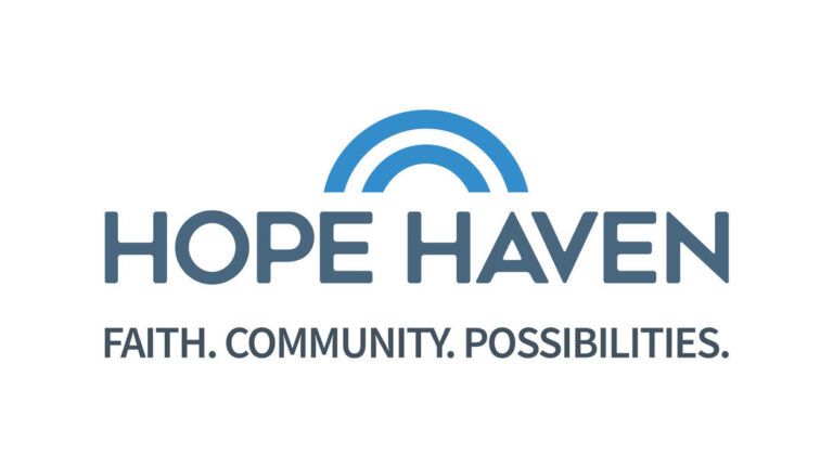
Hope Haven Inc. is proud to announce the launch of the new company logo and visual brand identity. The transformation is streamlined and modern while preserving a connection to its prolific history.
“After reviewing our needs in digital marketing and assessing how our brand was being received we decided that we needed to find new ways to connect to the next generation of client families donors and employees ” said Matt Buley Hope Haven Chief Executive Officer. “We wanted a simple look that new people could grasp and remember in a split-second.”
Designed by Franke+Fiorella a brand identity & design agency in Minneapolis MN the new visual identity puts forth a memorable mark reflective of Hope Haven’s progressive and competent reputation. This is achieved with the use of a bold sans serif font striking blue and charcoal colors and hopeful rising arches.
Hope Haven also introduces an updated tagline “Faith. Community. Possibilities.”
“Our faith comes first we exist in community with one another and together we are people of possibilities. That sums up a great deal of the work we are doing here each day ” added Buley. “At the core of Hope Haven is our faith in Christ. Honoring Him remains our first priority.”
Throughout the upcoming months Hope Haven will update all marketing collateral communications and experiences with the new logo and visual identity.
The post A New Look appeared first on Hope Haven.